
15th September 2019 by Chloe Roach

Earlier this year we started a fantastic project with the wonderfully named Awesome, who have six adventure playgrounds in Islington. They play a crucial role in the borough: providing free, fully-supervised play opportunities and open spaces for children and young people aged six to thirteen. Islington has the second fewest areas of open space in the whole country – so not only are these incredible spaces for young adventurers fun, they’re vital too.
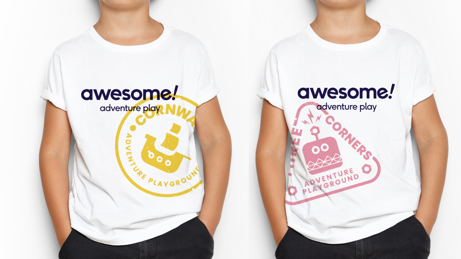
Awesome was suffering from a tired, underdeveloped brand and an overcomplicated logo that was in real need of some energy and modernisation. For the project to be a success, we knew the new brand truly needed to reflect what they do. This was straightforward enough, but then there was also the added challenge of the brand being used in other contexts, such as venue hire and their schools programme. So we took the old brand and developed it into something playful and creative, that was flexible enough to be used for all their services.
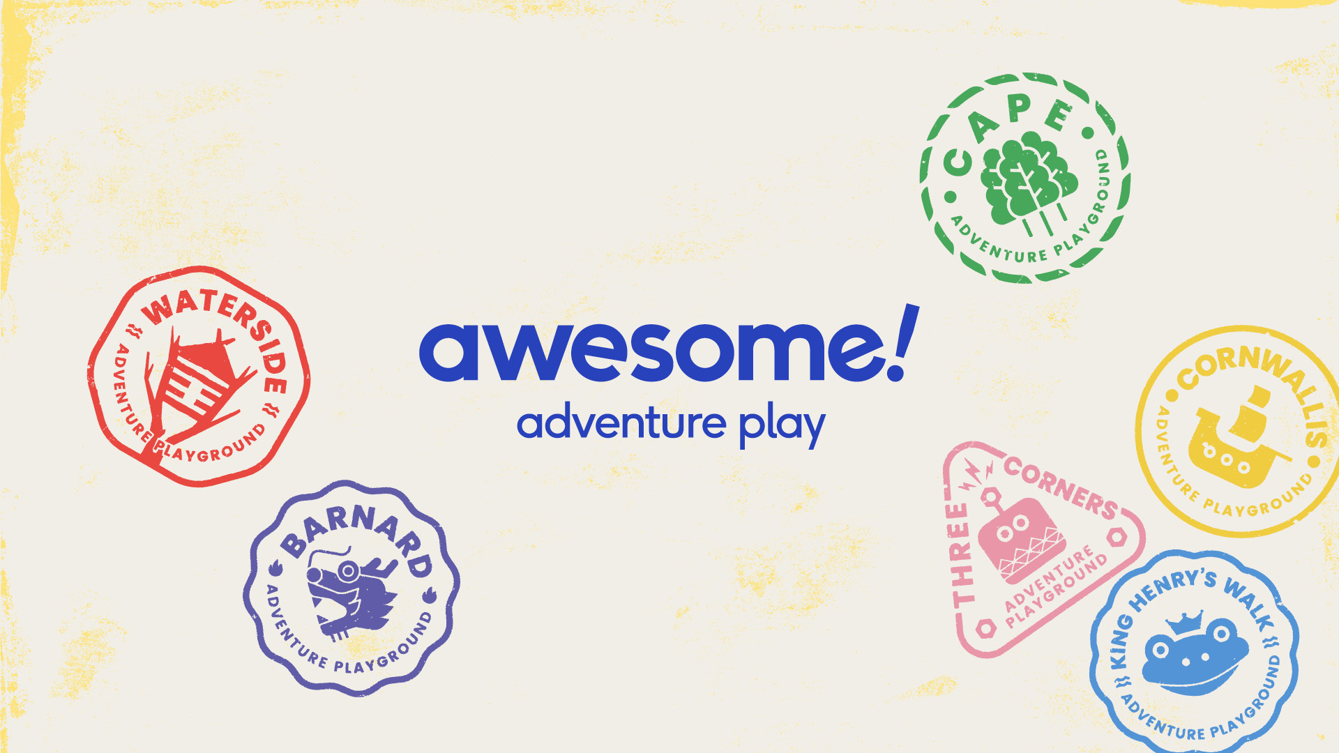
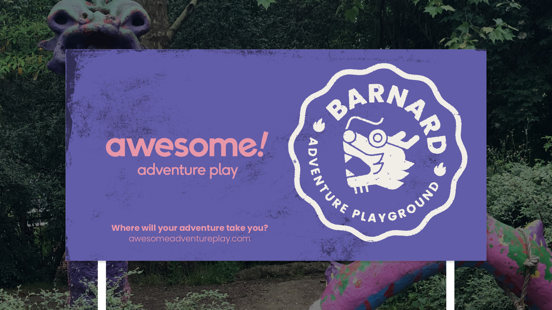
We loved the name Awesome – chosen by the children and young people. The previous logo felt too corporate so we stripped it back and allowed the name to shine, adding an exclamation point for energy!
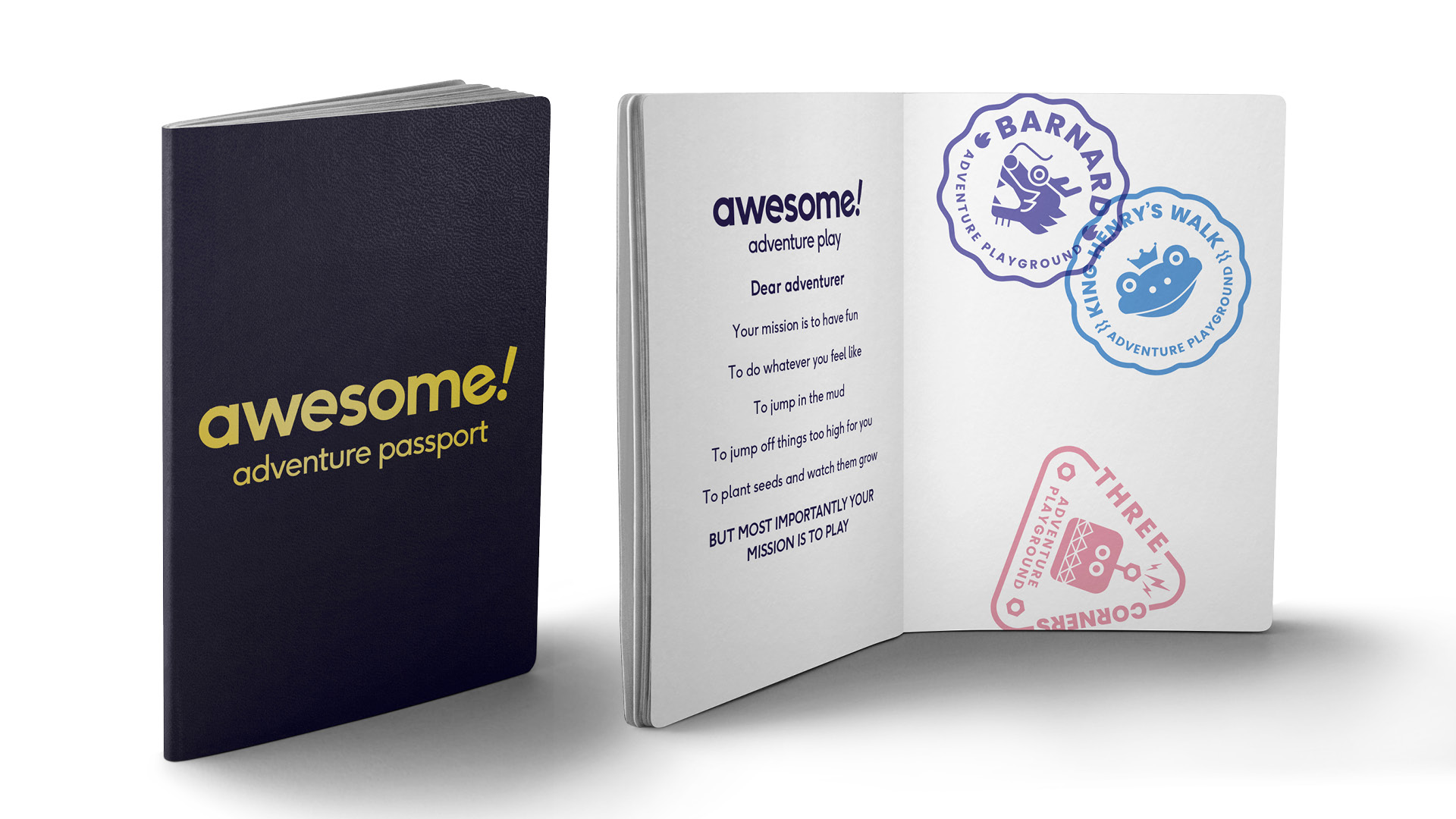
After we’d worked on the core branding for Awesome, we explored how a family of stamps could work alongside it. We were keen to capture the unique personality of each playground, so we suggested creating individual playground stamps (or sub-brands as we say in the non-adventuring world). We were inspired by our own adventures, travelling and passport stamps and loved the idea that each playground could have it's own stamp that the children could collect. This tied in to one of the project aims – to encourage children to visit the different adventure playgrounds.
But what should we use to represent each of the playgrounds? We decided to call in the experts. The children and young people gave us some great pointers about what they thought made each of their playgrounds special, so we used this to develop a series of stamps. We built a strong identity for each, where each stamp felt consistently powerful. The rest of the design is inspired by adventure scrapbooks with stamps, paint textures and stuck on photographs.
The Wired Canvas team has loved being involved in this project and rediscovering their inner adventurer. We’ll be launching the website in the near future – so watch this space!